Using Photos - Giants Win It All!
Biff Barnes
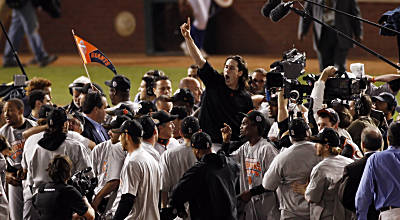
I’ve been a San Francisco Giants fan for all 52 years since they came west from New York. Only baseball fans in places like Chicago, Cleveland and until fairly recently, Boston can understand what that means. Watching year after year as your team struggles futilely in its quest for a championship is indeed as a Giant’s broadcaster described it “torture.” So I am feeling a very strange sense of excited contentment today. The photo below captures the reason.

Freelance writer Randy Murray, in his blog First Today, Then Tomorrow, offers some excellent tips on using photos and illustrations.
Murray begins, “Here’s the big secret: the image has to contribute to the reader’s understanding and comprehension of your text, not just to make the page more visually appealing.”
How do you decide when the image does contribute to the reader’s understanding. Murray suggests four guidelines to decide:
1. You are referring to the specific image in your text – they purpose of your text IS the image.
2. The image will allow you to take a shortcut. By pointing to the image you can significantly reduce your description or be more accurate. “It looks like this,” with a picture, might save you 500 words and keep your readers’ interest.
3. The image reinforces your message
4. The image provides credible evidence to back up your words. Think “news photo,” like the picture of a house fire. [Or maybe the Giants!]